BACK TO WORKCASE STUDY / 001
BRAND IDENTITYVISUAL SYSTEMSDIGITAL COMMERCE

ivisby.

Bringing print heritage into a new visual era.

2024—2025
SWEDEN / GOTLAND
An orange press roller, a printer’s loupe and stacks of coloured paper in warm workshop light.

Built on craft.
Made to adapt.

01 / A flexible visual identity designed for print, digital and everyday communication.
01THE CONTEXT

A heritage of making.
A system for what’s next.

ivisby brings together decades of experience in printing and graphic production. The challenge was to express that heritage through a contemporary, versatile brand identity — one that could feel at home on everything from a business card to a digital interface.

My work covered brand and identity design, the visual guidelines and a broad range of printed and digital applications. I also worked on the digital platform and the setup of an e-commerce experience using Shopify.

02THE VISUAL SYSTEM

Built on craft.
Made to adapt.

A distinct mark, clear typography and an expressive color palette create a recognizable identity that can scale across channels.
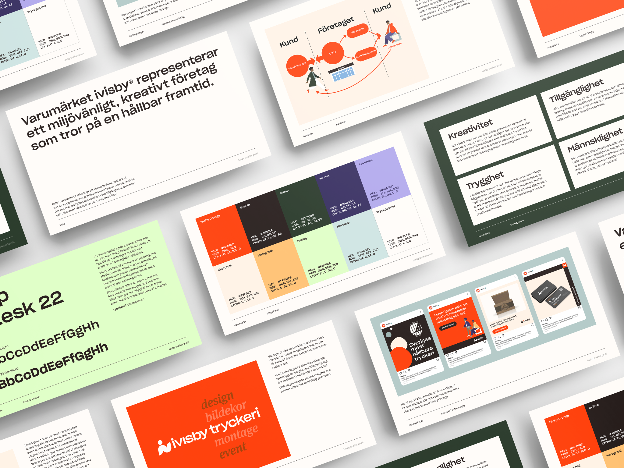
ivisby brand guidelines showing typography, the color palette, brand values and communication examples.
THE SYSTEM / Typography, color and communication guidelines
THE IDEA

Rooted in graphic production, the symbol references the movement of printing rollers and can also be read as the letters “i” and “v”. A considered design system carries that story into contemporary applications.

03FROM IDENTITY TO PRODUCTION

Designed to
leave the screen.

The physical applications demonstrate how the identity works across formats, substrates and scales. The visuals below are design and production mockups supplied for this case.
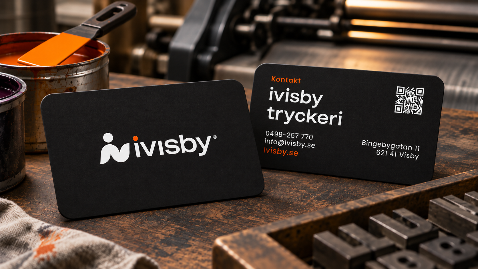
Matte black ivisby business cards with white branding, orange details and a QR code on a printing workshop bench.
BUSINESS CARDS / The identity at hand
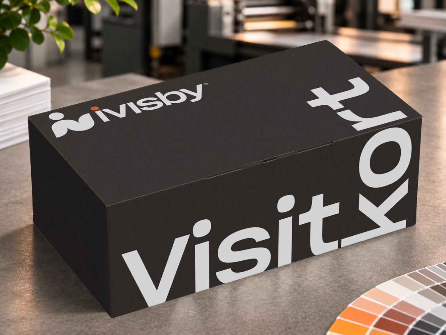
Charcoal business-card packaging box with the ivisby wordmark and oversized white typography.
PACKAGING / A branded home for printed matter
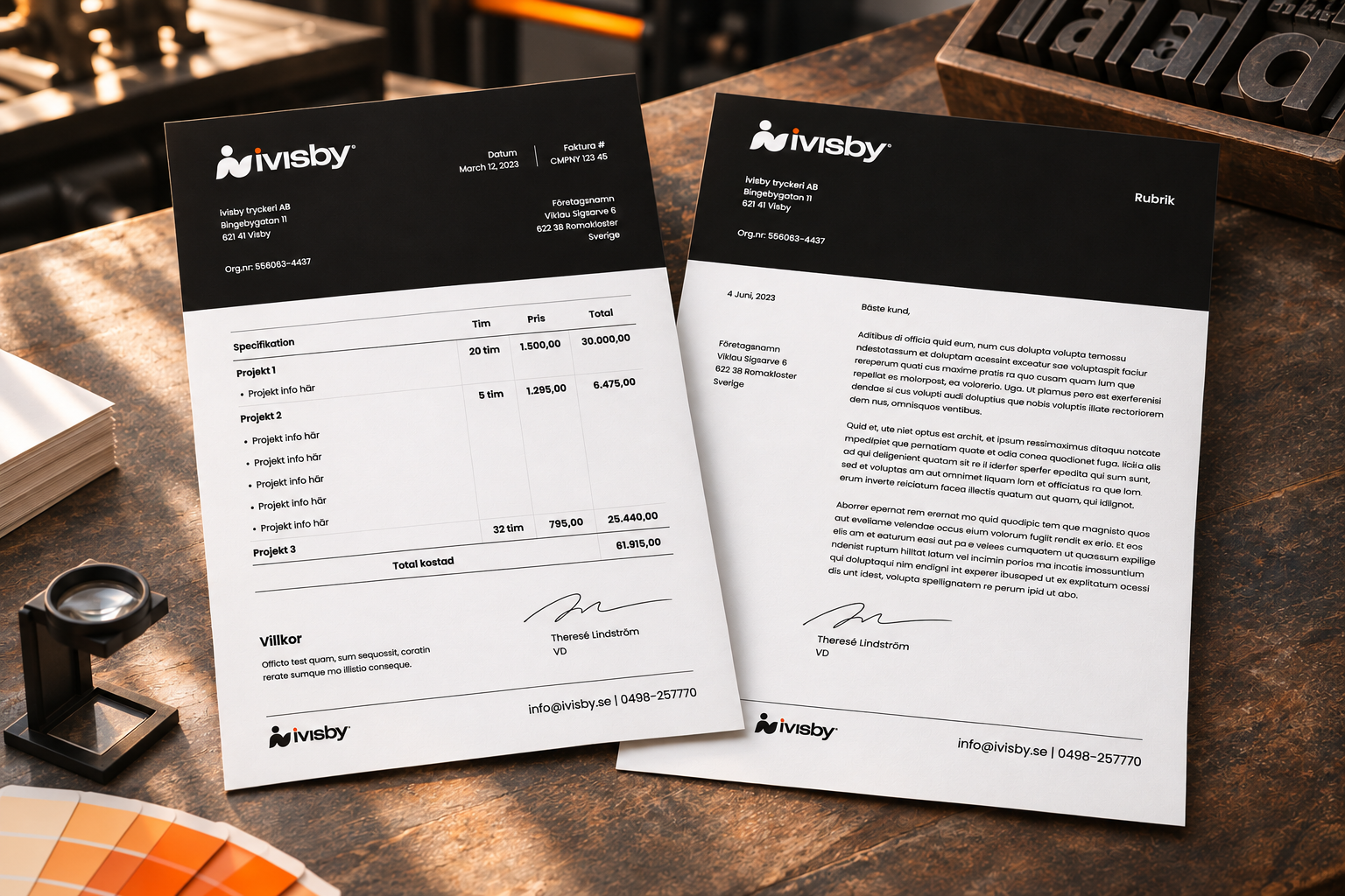
ivisby invoice and letterhead mockups with black headers and structured typography.
STATIONERY / Everyday correspondence
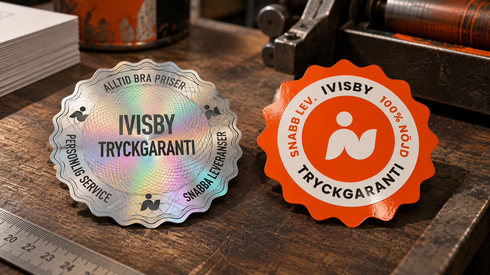
Silver holographic and orange ivisby print-guarantee seal sticker mockups.
LABELS / Print-guarantee seal mockups
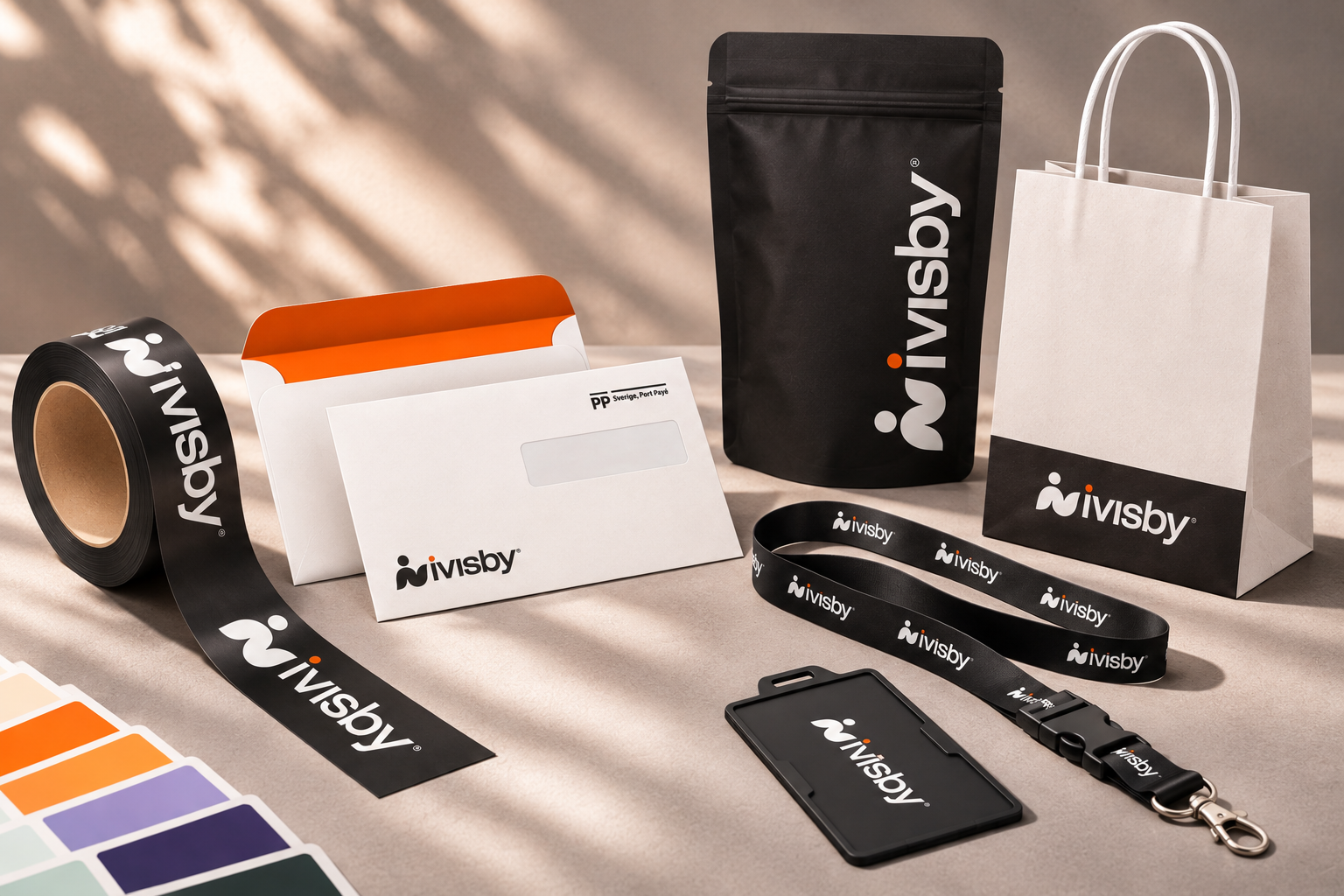
ivisby branded packaging, envelopes, paper bag, tape, lanyard and identity badge.
BRANDED OBJECTS / One system across materials
ONE IDENTITY / MANY APPLICATIONS

From the tactile
to the digital.

04DIGITAL COMMUNICATION

A consistent
digital presence.

The website mockup brings the same typography, color and production-led imagery into a digital setting.
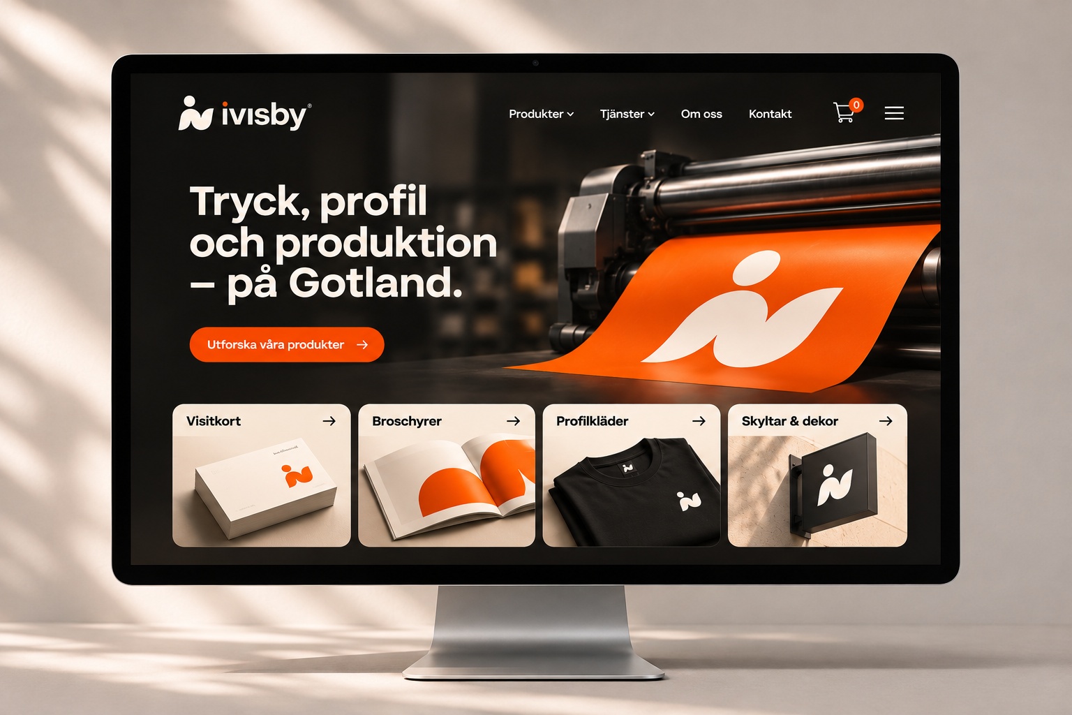
Desktop website design mockup for ivisby with a printing-press hero, orange call to action and product categories.
WEBSITE DESIGN / Desktop mockup
PLATFORM / SHOPIFY

Extending the identity into digital commerce.

Alongside the visual identity, my work included building ivisby’s digital platform and setting up its Shopify-based webshop, with the intention of connecting the brand experience across physical and digital touchpoints.
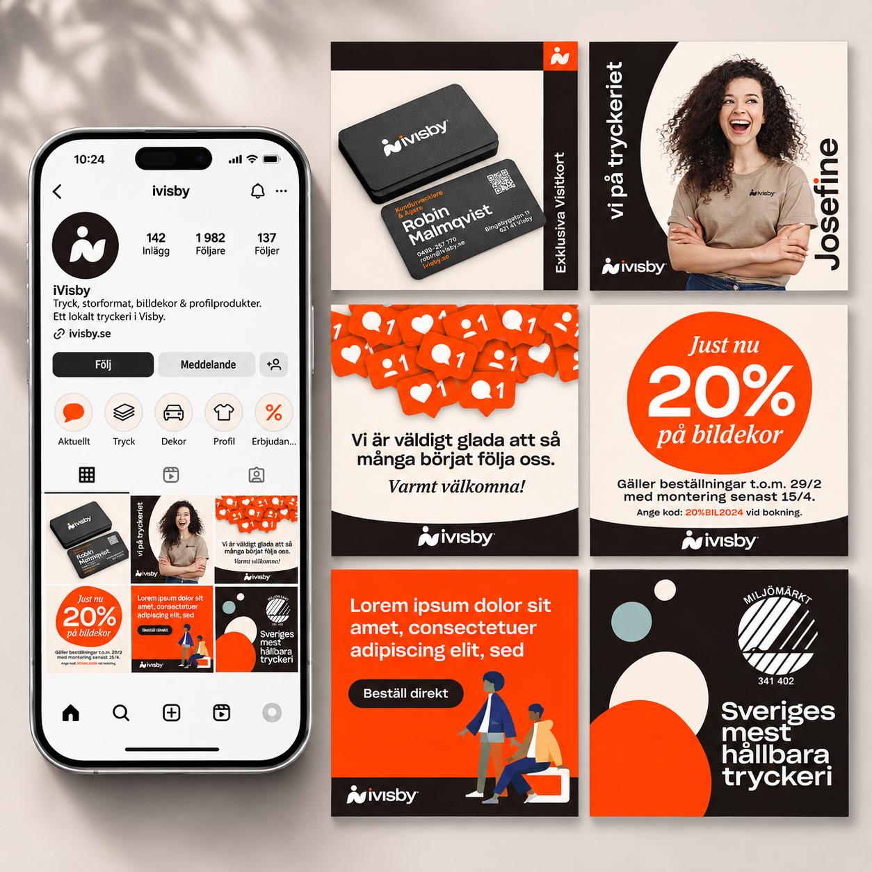
The ivisby Instagram profile on a phone alongside six branded posts featuring business cards, a staff portrait and promotions.
SOCIAL MEDIA / Instagram profile and posts
05AN IDENTITY IN USE

Small details.
Broad reach.

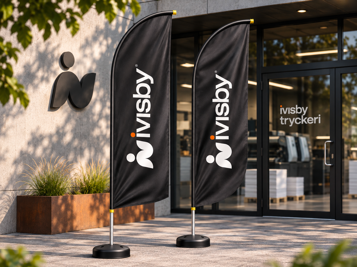
From workwear to vehicle graphics, the identity was designed to remain recognizable at different scales. The supplied mockups show that range in context.
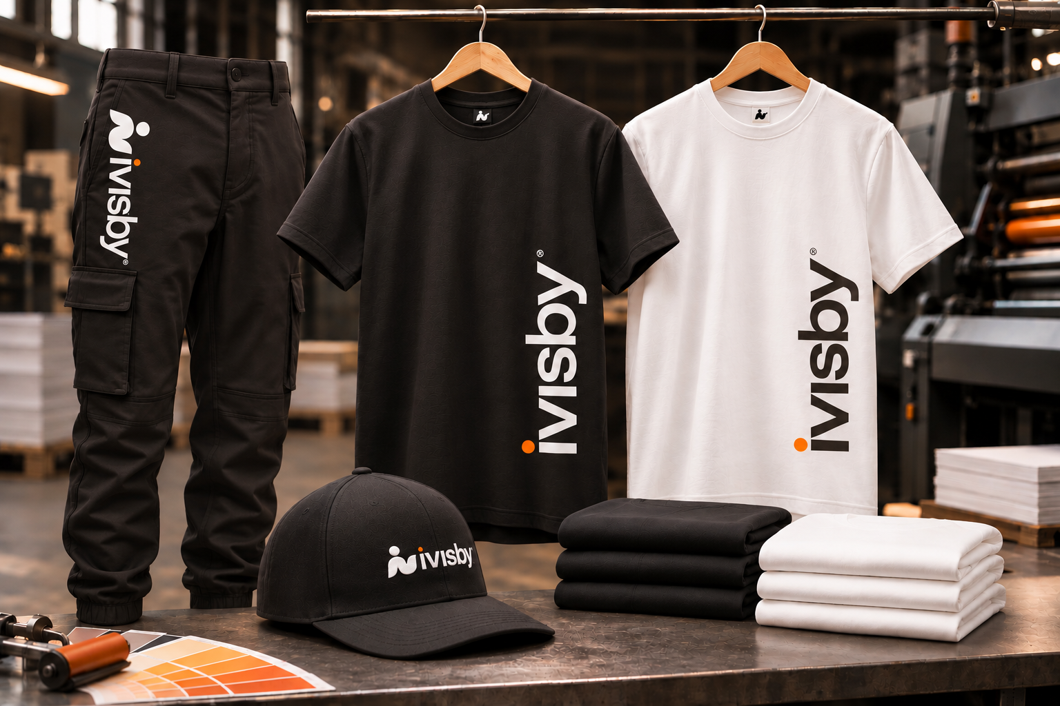
ivisby workwear mockup with branded black trousers, black and white T-shirts and an embroidered cap.
WORKWEAR / A shared identity for the team
Two black ivisby feather flags with white branding and orange accents outside the printshop entrance.
SIGNAGE / A recognizable welcome at the printshop
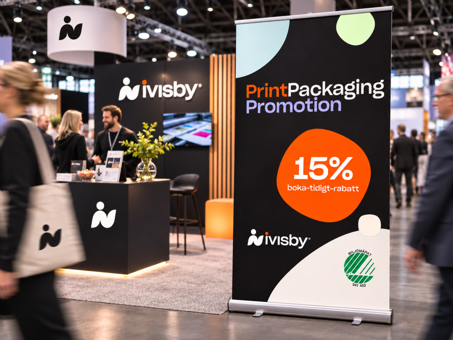
A black roll-up banner displays a 15% early-booking offer beside the ivisby trade show booth.
TRADE SHOW / Booth and roll-up banner
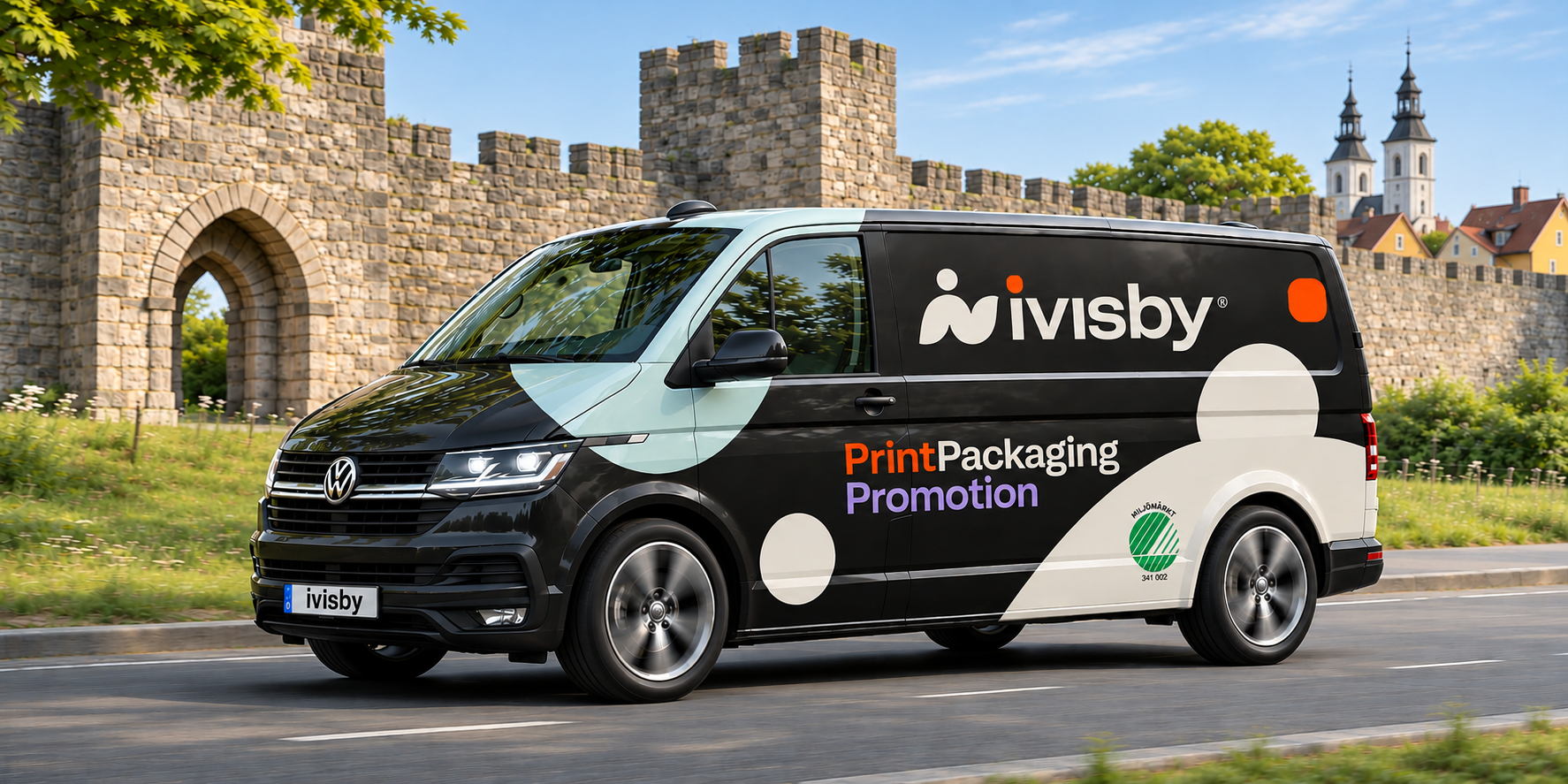
Black Volkswagen Transporter with ivisby graphics passing the city wall in Visby.
VEHICLE GRAPHICS / The identity out in the world
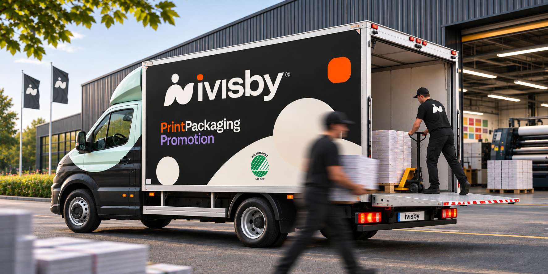
An ivisby box truck with a large white wordmark on its black side panel, loading printed materials outside the printshop.
VEHICLE GRAPHICS / Box truck at the printshop
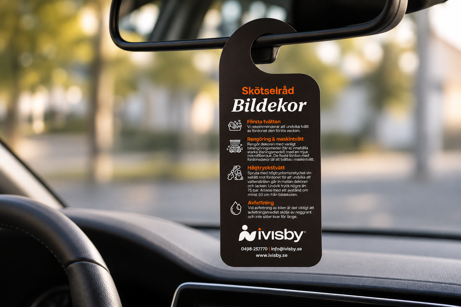
Black ivisby mirror hanger with orange headings, white icons and vehicle-wrap care instructions hanging from a car rear-view mirror.
AFTERCARE / Vehicle-wrap care instructions
06THE TAKEAWAY

One coherent system.
Many ways to show up.

The work brought together identity thinking, graphic production and digital design in a visual language designed to travel across different media. These are documented design deliverables; no unverified commercial impact or performance metrics are claimed.

BACK TO SELECTED WORK